Abstract
Provision of nutrition information on food label is an important public health tool to promote a balanced diet. Legible food label with essential information of product appropriately marked would assist consumers make informed choices. When a food label is not properly designed, consumers may have difficulty reading the labels for information they required.
2. In May 2012, the Centre for Food Safety (CFS) issued the Trade Guidelines on Preparation of Legible Food Label (the Guidelines) aim at assisting the trade in providing legible information on food label including nutrition label (NL). The Guidelines provide principles and examples of legible food labels for reference.
3. The CFS and the Consumer Council have conducted a joint study to have a snap shot on whether the trade provides legible NL in accordance with the Guidelines and provide advices to trade for improving the legibility of NL.
Background
4. The Guidelines provided recommendations on the key elements for a legible NL, include suitable font size, good contrast, enough spacing and other relevant factors.
Font Size
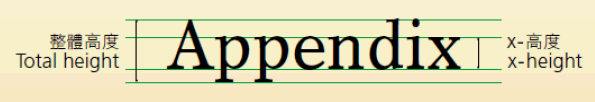
5. In general, a font size of at least 1.2mm x-height* for English letter and Chinese characters in comparable size is recommended. However, the recommended font size may not be always practically feasible such as some products with limited package size (e.g. package of total surface area less than 400cm2), or when the information is presented in more than one language (e.g. in Chinese and English). In any case, a minimum font size of at least 0.8 mm x-height for English letters and 1.8 mm total height for Chinese characters should be provided.
Contrast
6. Whenever practical, all black or single dark colour type, printed on a white or other single light colour contrasting background is recommended. It is also acceptable to do it vice versa as long as the words are clearly shown. In addition, for products packed in transparent containers, it is recommended that the food label area should come with a non-transparent contrasting background, so that the clarity of the label would not be affected by the colour or appearance of the food.
Spacing
7. Words and characters should be displayed in such a manner that they do not touch each other or the lines and borders surrounding or separating the information, if any.
8. Apart from the above elements, it is also noted that the clarity of words may be enhanced by other relevant factors such as appropriate font type, suitable printing technology and non-reflective printing surface.
The Study
9. This study covered 100 samples of relatively small package size prepackaged food items in local market, including biscuits, bread/cake, crispy snacks, milk/milk beverage/yoghurt/yoghurt drinks, canned sardine, canned luncheon meat and non-alcoholic beverages.
10. These samples were purchased from various chain food premises such as supermarkets, retail stores, convenience stores and bakery stores etc between August and September 2013.
11. The font size was measured by the Food Research Laboratory of the CFS. Other elements were assessed by a CFS panel. In addition, consumers were invited to comment if the NL legibility needs improvement on certain samples in order to collect consumer's expectation.
12. CFS considered a total of 63 samples not complying with the recommendations as stated in the Guidelines with details as follows:
| Recommendations in the Guidelines | No. of non-complying samples |
|---|---|
| Suitable font size | 51 |
| Suitable printing technology | 15 |
| Good contrast | 9 |
| Enough spacing | 5 |
| Non-reflective printing surface | 2 |
13. This study targeted on samples of relatively small package size prepackaged food items. Significant amount of these samples need improvement on NL legibility, particularly font size.
14. A total of 31 samples have NLs affixed to the packaging, while the remaining 69 samples have NLs printed on the packaging direct. Higher proportion of the former samples does not comply with the recommendations for "font size", "printing technology" and "inadequate spacing" . Details are as follows:
| Percentage of samples with NLs affixed to the packaging not complying with the recommendation | Percentage of samples with NLs printed on the packaging not complying with the recommendation | |
|---|---|---|
| Small font size | 61% ( 19/31) | 47% (32/68*) |
| Poor printing technology | 39% ( 12/31) | 4 % ( 3 /69) |
| Inadequate spacing | 16% ( 5/31) | 0 % ( 0 /68*) |
* The font size and spacing of a sample could not be assessed.
15. Consumer group members also opined that the legibility of NL of most of the samples needed improvement particularly on the font size.
16. The study revealed that a significant amount of products did not provide NLs in accordance with the Guidelines. As such, CFS urges the trade to make reference to the Guidelines to provide legible NL with proper font size, contrast and spacing. In addition, traders should apply suitable printing technology and provide enough spacing in NLs, particularly for affixed NLs. Other advices include
-
to ensure the printing will not be removed, erased or rubbed off under normal conditions of storage
-
to provide larger NLs for products with adequate surface area
-
to consider attaching hang tags (if applicable) with NLs to products with small surface area
-
to provide NLs in conspicuous place
More Information
17. The related article is published in the CHOICE MAGAZINE (Issue 448 released on 17 Feb 2014) (Chinese only).